
 Before
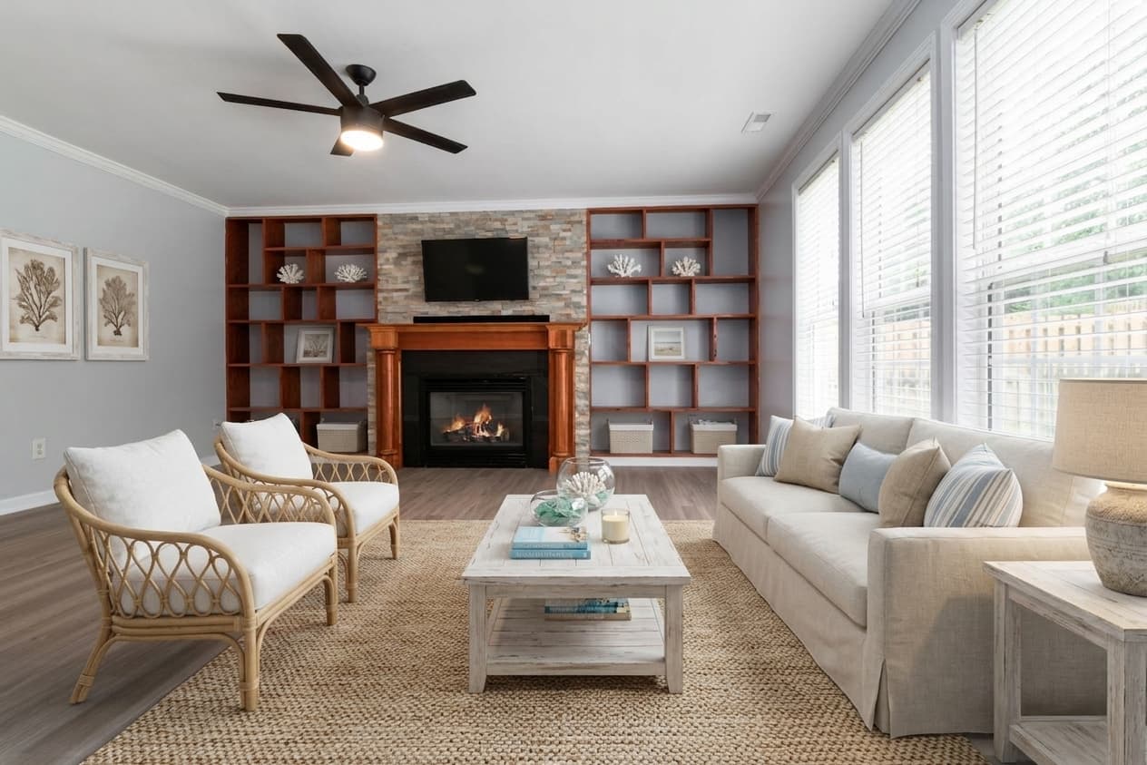 After
AfterWhat defines coastal staging
Coastal staging uses a light, sun-bleached palette: white and sand-toned furniture with soft blue accents introduced sparingly (a pillow, a piece of art), light rattan or whitewashed wood, and airy, loosely-woven linen fabrics. Everything about the material choice signals warm-weather and light — no dark wood, no heavy upholstery.
Decor stays subtle and referential rather than literal — think a woven basket or a piece of driftwood-toned art, not anchors, ship wheels, or beach-kitsch signage. The best coastal staging reads as "relaxed beach-house living" rather than a novelty gift shop.
This is one of the more geographically-specific styles: it's designed to echo homes with actual proximity to water — beach towns, lake communities, coastal cities — where buyers are shopping for that specific lifestyle, not just a color palette.
Which listings it suits
- Genuine coastal, beachfront, and lake-community listings, where the style matches the actual selling point of the property (proximity to water, vacation lifestyle).
- Vacation-rental and second-home listings, where buyers are explicitly shopping for a relaxed, warm-weather aesthetic rather than daily-driver practicality.
- Mid-to-upper price bands in resort and waterfront markets, roughly $400K-$1.5M, where the lifestyle framing does real work in the listing photos.
Avoid it for landlocked, inland suburban listings with no real water proximity or vacation-market context — buyers can tell the staging doesn't match the actual property location, and it can read as an odd, disconnected choice rather than aspirational.
What to check in an AI render of coastal style
Not every AI staging render nails a style consistently. Here's what to look for specifically when judging a coastal render before you publish it to the MLS:
Blue overused past "accent"
Coastal staging uses blue as a sparing accent, not a dominant color. If a render fills the room with saturated blue furniture rather than white/sand tones with small blue touches, it's overcorrecting into a more literal "beach theme" than the actual design style.
Literal beach props instead of material cues
Watch for an AI render leaning on literal nautical decor — anchors, shells, ship imagery — rather than the material and color vocabulary (rattan, linen, whitewash) that actually defines the style. Literal props read as souvenir-shop kitsch, not coastal design.
Rattan rendered too heavy or dark
Coastal rattan should be light-toned and airy. A render using dark wicker or heavy rattan furniture shifts the look toward tropical or Caribbean styling rather than the light, sun-bleached coastal look — check the wood/rattan tone specifically.
Try Coastal staging on your own listing
Upload a listing photo — Coastal is preselected, and the free tier gives you 6 watermarked renders a day, no signup required.
Try this Coastal lookFrequently asked questions
- Should I use coastal staging for a listing that's not near water?
- Generally no. Coastal staging is geographically specific — it's meant to reinforce a property's actual proximity to a beach, lake, or vacation destination. On a landlocked listing it can read as a mismatched theme rather than a natural fit.
- Is coastal staging only for luxury waterfront homes?
- No — it works across price bands within coastal and lake markets, from starter beach condos to $1.5M+ waterfront properties. The determining factor is location and lifestyle context, not price point alone.
- How does coastal differ from Scandinavian staging?
- Both use light, airy palettes, but coastal adds warm sand tones and rattan with sparing blue accents, evoking a beach lifestyle. Scandinavian stays cooler and more neutral (white, grey, pale oak) with no color-of-place reference — it's about light, not location.
- What kind of listing does coastal staging suit best?
- Second-home, vacation-rental, and lifestyle-relocation listings in genuine coastal or lake markets tend to suit coastal staging best — settings where the property's proximity to water is itself part of the pitch, not just a house.